Creating an E-commerce Sales Dashboard in Looker Studio
E-commerce businesses generate massive amounts of data. The challenge isn’t collecting data—it’s turning it into actionable insights. In this guide, I’ll walk you through building a complete e-commerce sales dashboard in Looker Studio that I’ve refined through dozens of implementations.
By the end, you’ll have a dashboard that answers these critical questions:
- How are sales trending?
- What products are performing best?
- Where are customers coming from?
- What’s the average order value?
- Which regions drive the most revenue?
The Dashboard We’ll Build
Here’s an example of the type of e-commerce dashboard we’ll create:
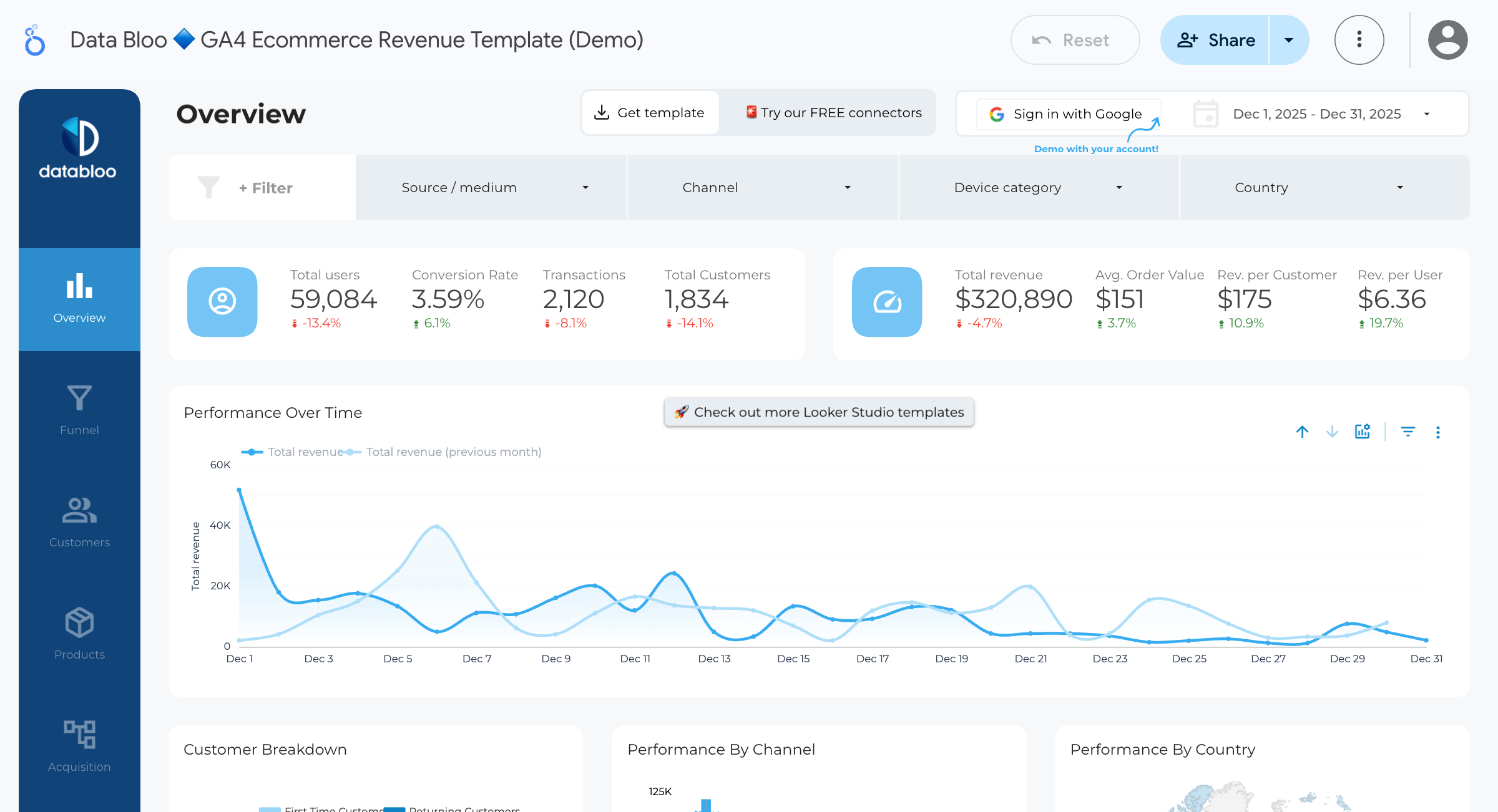
Our e-commerce dashboard will include:
- KPI Scorecards - Total revenue, orders, AOV, customers
- Sales Trend Chart - Revenue over time
- Product Performance Table - Top products by revenue
- Geographic Breakdown - Sales by region/country
- Category Analysis - Revenue by product category
- Interactive Filters - Date range, category, region
Prerequisites
You’ll need:
- Looker Studio account
- E-commerce data source (we’ll use a Google Sheets example, but this works with BigQuery, GA4, or any data source)
- Understanding of your key metrics
Step 1: Prepare Your Data
First, let’s ensure your data has the right structure. A typical e-commerce dataset should include:
| Field | Type | Example |
|---|---|---|
| order_id | Text | ORD-12345 |
| order_date | Date | 2024-01-15 |
| customer_id | Text | CUST-789 |
| product_name | Text | Blue Widget |
| category | Text | Electronics |
| quantity | Number | 2 |
| unit_price | Number | 49.99 |
| total_revenue | Number | 99.98 |
| region | Text | North |
| country | Text | United States |
| traffic_source | Text | Google Ads |
Sample Data for Testing
If you want to follow along, create a Google Sheet with this structure and at least 100 rows of sample data.
Pro Tip: For realistic data, vary your dates across 3-6 months, include 10-20 products across 3-5 categories, and distribute orders across multiple regions.
Step 2: Connect Your Data Source
- Open Looker Studio
- Click Create → Report
- Select your data source:
- For Google Sheets: Select the sheet
- For BigQuery: Choose your table or custom query
- For GA4: Connect your property
- Click Add to create the report
If Using BigQuery (Recommended for Large Datasets)
Use this optimized query:
SELECT
  DATE(order_date) AS order_date,
  order_id,
  customer_id,
  product_name,
  category,
  region,
  country,
  traffic_source,
  quantity,
  unit_price,
  total_revenue
FROM `your-project.your_dataset.orders`
WHERE order_date >= DATE_SUB(CURRENT_DATE(), INTERVAL 365 DAY)
Step 3: Set Up the Dashboard Layout
Before adding charts, plan your layout:
+------------------------------------------+
|           📊 E-commerce Dashboard         |
|           [Date Range Filter]             |
+----------+----------+----------+----------+
| Revenue  | Orders   |   AOV    | Customers|
+----------+----------+----------+----------+
|          Sales Trend Over Time            |
+--------------------+---------------------+
| Top Products       | Sales by Category   |
+--------------------+---------------------+
|        Sales by Region (Map/Chart)        |
+------------------------------------------+
Step 4: Create KPI Scorecards
Add four scorecards across the top:
Scorecard 1: Total Revenue
- Click Add a chart → Scorecard
- Configure:
- Metric: total_revenue
- Aggregation: SUM
- Style:
- Large, bold number
- Add currency prefix ($)
- Add comparison (vs previous period)
Scorecard 2: Total Orders
- Add another scorecard
- Configure:
- Metric: order_id
- Aggregation: COUNT DISTINCT
Scorecard 3: Average Order Value (Calculated Field)
First, create a calculated field:
- Click Add a field in your data source
- Name:
Average Order Value - Formula:
SUM(total_revenue) / COUNT_DISTINCT(order_id)
Then add a scorecard using this field.
Scorecard 4: Total Customers
- Add scorecard
- Configure:
- Metric: customer_id
- Aggregation: COUNT DISTINCT
Pro Tip: Add comparison to previous period for all scorecards. Users love seeing whether metrics are up or down.
Step 5: Add Sales Trend Chart
- Add a Time Series Chart
- Configure:
- Dimension: order_date
- Metric: total_revenue (SUM)
- Optional enhancements:
- Add a trend line (Style panel)
- Add comparison period (toggle in Data panel)
- Set granularity (day, week, month)
Adding Multiple Metrics
To show revenue AND orders on the same chart:
- Add
order_id(COUNT DISTINCT) as a second metric - In Style panel, set the second metric to use the right Y-axis
- This creates a dual-axis chart
Step 6: Create Product Performance Table
- Add a Table chart
- Configure:
- Dimension: product_name
- Metrics:
- total_revenue (SUM)
- quantity (SUM)
- order_id (COUNT DISTINCT) - label as “Orders”
- Add sorting:
- Sort by total_revenue, descending
- Style:
- Add heat map to revenue column
- Limit to top 10 rows
- Add pagination for full list
Add a Calculated Metric: Revenue per Order
- Create calculated field:
SUM(total_revenue) / COUNT_DISTINCT(order_id) - Add to table
- This shows which products have higher transaction values
Step 7: Add Category Breakdown
- Add a Pie Chart or Donut Chart
- Configure:
- Dimension: category
- Metric: total_revenue (SUM)
- Style:
- Limit to top 5 categories
- Show percentages in labels
- Use consistent colors
Alternative: Use a Bar Chart for easier comparison:
- Horizontal bars work better for category names
- Add data labels for exact values
Step 8: Geographic Analysis
Option A: Geo Map (if you have country/region data)
- Add a Geo Map
- Configure:
- Dimension: country (or region)
- Metric: total_revenue (SUM)
- Style:
- Choose color range (light to dark)
- Enable tooltips
Option B: Bar Chart by Region
- Add a Bar Chart
- Configure:
- Dimension: region
- Metric: total_revenue (SUM)
- Sort by revenue, descending
Step 9: Add Interactive Filters
Date Range Filter
- Add Insert → Date range control
- Position at the top of the dashboard
- Set default range (e.g., last 30 days)
Category Filter
- Add Insert → Drop-down list
- Configure:
- Control field: category
- Position next to date range
Region Filter
- Add another Drop-down list
- Configure:
- Control field: region
Pro Tip: Use Advanced filters to let one chart filter others. Click on a product in the table, and all charts update.
Step 10: Add Traffic Source Analysis (Bonus)
If you have traffic source data:
- Add a Bar Chart
- Configure:
- Dimension: traffic_source
- Metrics:
- total_revenue (SUM)
- order_id (COUNT DISTINCT)
- This shows which channels drive the most revenue
Calculate Conversion Value by Source
Create calculated field:
SUM(total_revenue) / COUNT_DISTINCT(customer_id)This shows revenue per customer by traffic source.
Advanced Enhancements
Calculated Fields for Deeper Insights
Customer Lifetime Value (simplified):
SUM(total_revenue) / COUNT_DISTINCT(customer_id)Revenue per Unit:
SUM(total_revenue) / SUM(quantity)Month-over-Month Growth: Use comparison features in scorecards and time series charts.
Conditional Formatting
In tables, add conditional formatting:
- Click on a metric in the table
- Go to Style → Conditional formatting
- Add rules:
- Green if revenue > $10,000
- Red if revenue < $1,000
Drill-Down Capabilities
Enable drill-down for hierarchical data:
- In a chart, add multiple dimensions
- Enable Drill down in Data panel
- Users can click to go from Category → Product → SKU
Dashboard Best Practices
Based on 8+ years of building e-commerce dashboards:
1. Focus on Actionable Metrics
Include metrics that drive decisions:
- ✅ Revenue trend (take action on dips)
- ✅ Top products (stock management)
- ✅ Regional performance (marketing focus)
- ❌ Page views (not directly actionable)
2. Use Consistent Time Periods
All charts should default to the same date range. Use the date filter to control everything.
3. Add Context
Include:
- Comparison to previous period
- Target lines where relevant
- Brief explanatory text for complex metrics
4. Optimize for Your Audience
- Executives: High-level KPIs, trends
- Marketing: Channel performance, customer acquisition
- Operations: Product inventory, regional distribution
Common Issues and Fixes
| Issue | Cause | Solution |
|---|---|---|
| Revenue shows as 0 | Field type is Text | Change to Number in data source |
| Date not sorting correctly | Wrong date format | Ensure YYYY-MM-DD format |
| Filters not working | Not connected to data source | Check filter settings |
| Dashboard is slow | Too much data | Add date filters, use BigQuery |
Sample Dashboard Template
Here’s a quick reference for your layout:
Row 1: Title + Date Filter + Category Filter Row 2: 4 KPI Scorecards Row 3: Sales Trend (full width) Row 4: Product Table (50%) + Category Pie (50%) Row 5: Regional Map or Bar Chart (full width)
Need Help Building Your E-commerce Dashboard?
Building effective dashboards takes time and expertise. If you need help:
- Connecting to your data sources (Shopify, WooCommerce, BigQuery)
- Creating custom metrics and KPIs
- Optimizing performance for large datasets
- Building executive-level reporting
Schedule a free consultation and let’s build a dashboard tailored to your business.
Want more Looker Studio tutorials? Check out our guides on Building Your First Dashboard and Marketing Attribution Dashboards.
Related Posts
How to Build Your First Looker Studio Dashboard: Step-by-Step Guide
Learn how to create your first Looker Studio dashboard from scratch. This comprehensive guide covers data connections, chart creation, and best practices for building effective dashboards.
Connecting BigQuery to Looker Studio: Complete Setup Guide
Learn how to connect BigQuery to Looker Studio with this comprehensive guide. Covers authentication, custom queries, performance optimization, and troubleshooting common issues.
Marketing Attribution Dashboard: Track Campaign ROI in Looker Studio
Build a marketing attribution dashboard in Looker Studio to track campaign ROI, channel performance, and customer acquisition costs. Includes multi-touch attribution models.